T-Shirt Fonts: Here’s How To Choose the Right One
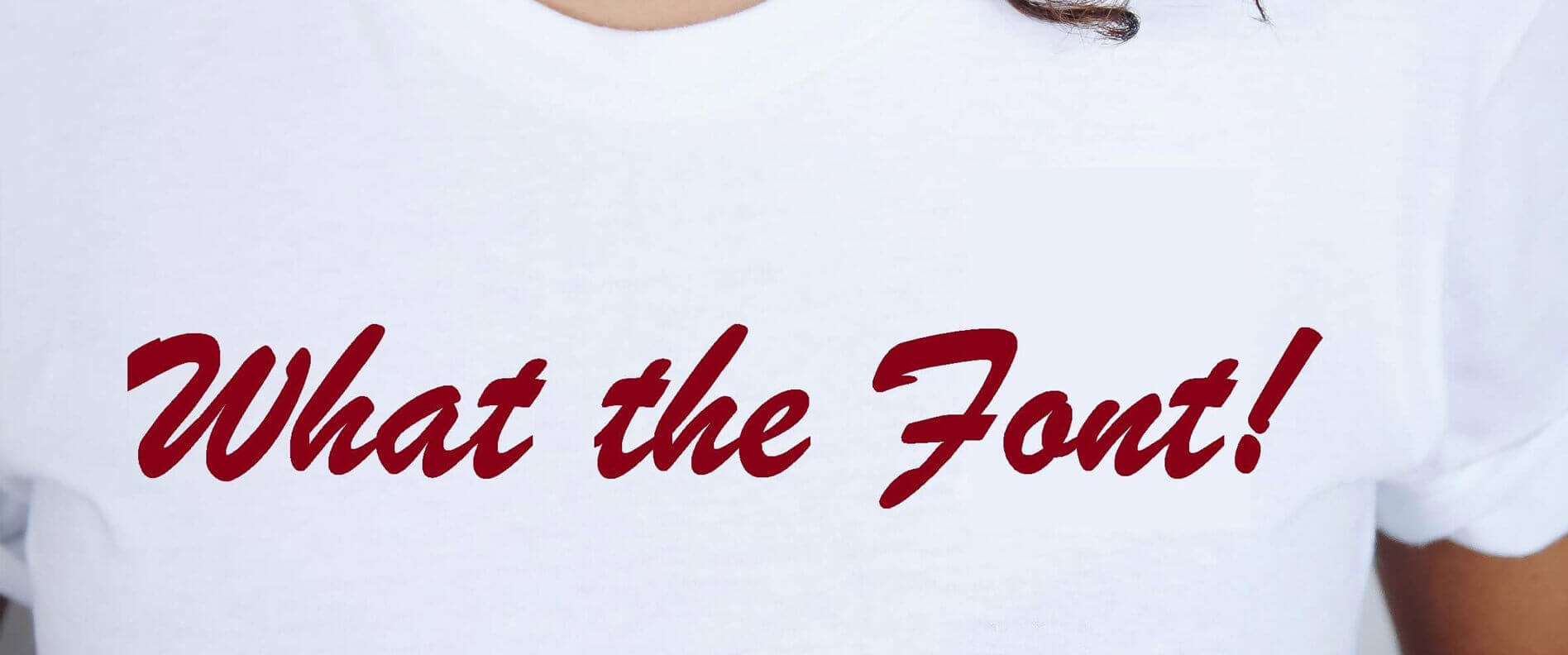
T-shirt font styles.
If you have a t-shirt business, these are words that have likely haunted you at some point in your career.
Going into the business, you had never thought that choosing t-shirt FONTS would be so much trouble, right? There were greater things to worry about such as the fabric, colors, sizes, cost, and more.
But you were wrong.

Nowadays, less is more – youngsters prefer clothing that is not over-done with designs, colors or embellishments. Often, they go for minimalistic shirts with a few words in – wait for it – a great font!
But you can stop worrying because we will show you how you can achieve the perfect combination that will appeal to your customers and greatly enhance your sales.
Familiarize yourself with the list of the important considerations which will help you to pick the best t shirt fonts.
- Understanding Typography, Font, and Typeface
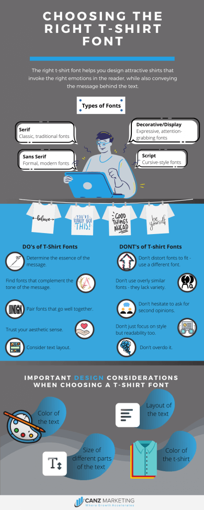
- Why T-Shirt Font Styles Matter
- The Different Types of Fonts to Play Around With
- Choosing the Best Fonts for T-Shirts
- Determine the Message You Want to Give
- Focus on the Essence of the Message
- Find Fonts that Sit Well with the Message
- Pair Fonts with Each Other Well
- Pair the Fonts with Other Design Elements
- Choose the Best T-Shirt Font Design from the Shortlisted Options
- Trust Your Aesthetic Sense and Judgment
- Don’t Stick to the Same Design Elements
- Don’t overdo it
- Pay Attention to Space and Placement
- Choose Readability Over Style
- Don’t Scale and Distort
- Identifying Good T-Shirt Fonts from Bad Ones
- What Printing Specifics Do I Need to Know?
- Top Resources for Fonts
Before we do that, let’s take a look at what typography is and try to understand its importance.
Let’s begin!
Understanding Typography, Font, and Typeface
Typography – Typography is basically the design or style of the text, as well as how it is arranged in a particular space to get the desired look.
Typeface – A typeface contains letters, numbers, and symbols among other things that follow the same style. An example would be Calibri.
Font – A font is a typeface that is a particular size and style. So bolded and italicized text in the typeface Calibri, size 12, is an example of a font.
All of this seems very basic.
And it is – when you’re completing an assignment in Word. But when it comes to anything more complicated than that, you have to give the typography a great deal of thought.
In art and design, whether you’re designing for the web or making decisions regarding typography in shirt designs, you have to keep many things in mind.
What style do I want the text to be in?
How do I choose a font size for t-shirt printing?
Do I want it slanting to the right or upright?
What color should I use?
Does the combination I’ve reached after making all these decisions work?
No? Back to step one!
But why?
Let’s talk about it!
Why T-Shirt Font Styles Matter
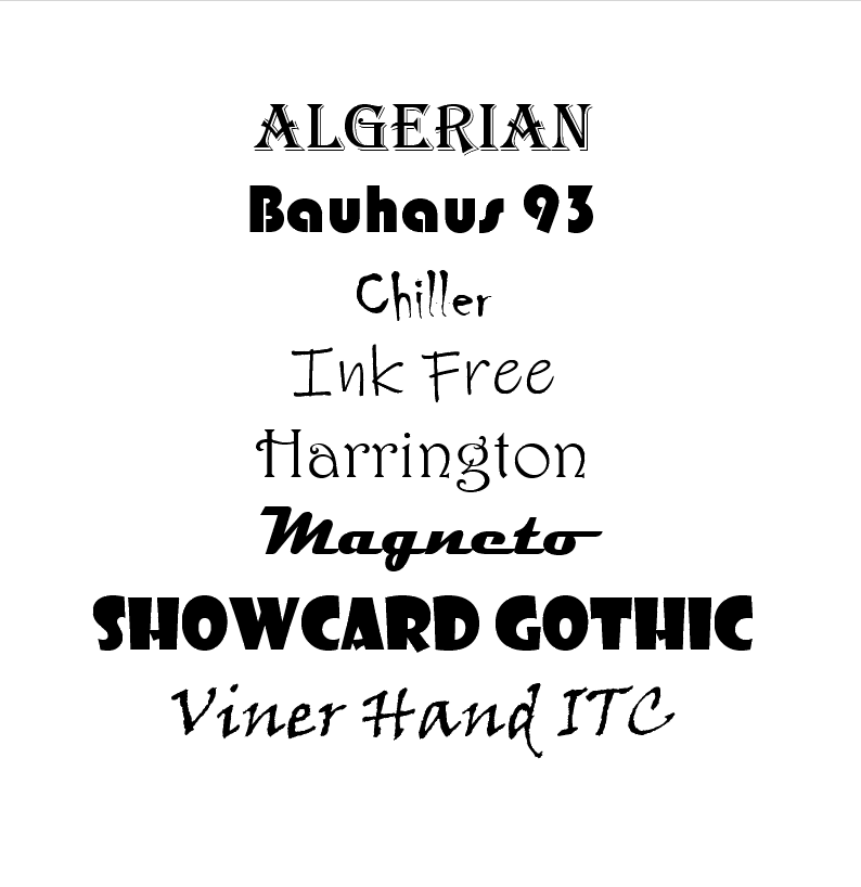
So we opened up a Word document and selected a few fonts to test at random.
Take a good look at these fonts.
Can you imagine using the font ‘Chiller’ for the text ‘Hope?’
Or could you use ‘Magneto’ for a t-shirt with a traditional message?
The answer to both of these questions, understandably, is no. Why? Because they just don’t go together.
But there is more to it than that.
People are subconsciously affected by fonts. The layout, style, and structure of the text they are looking at is what gives them their first impression – it is what makes them feel good about the thing associated with the text or otherwise.
Now put that in the context of the text that will appear on a person’s t-shirt.
The clothes we wear reflect our personal style. It wouldn’t be wrong to say that they are a glimpse into us as a person. Thus, the best shirt designs are those that complement our personality and scream out who we are before we even get a chance to introduce ourselves.
A t-shirt font design contributes to that – the text and the way it is displayed tells someone a little bit about the person wearing the shirt.
But more importantly:
It makes us feel better about ourselves and helps us feel perfectly in our element.
So although you may never have thought about it like this, fonts trigger certain emotional responses from the wearer of the shirt, as well as the people around them.
And that is why you need to pick out the best fonts for the t-shirts you design.
So how do you do it?
Read on and find out.
The Different Types of Fonts to Play Around With
1. Serif Fonts
Serif fonts are classic, traditional fonts that are characterized by the little feet they have at the beginning and end of strokes.
These fonts have been used since the 15th century and are easy to read.
2. Sans Serif
Sans Serif fonts don’t have the traditional feet that characterize the serif fonts.
They came about much later than the serif fonts and are seen as a more modern version.
They offer a clean look and are, again, considered easy on the eyes while making a statement.
3. Script
Script fonts, in their essence, are fonts that look like they have been handwritten in a cursive style.
But that doesn’t mean that they’re always casual. There are versions that make the work look like it was written by a maestro from the olden days.
That said, there are also options that are quite casual and perfect for delivering light-hearted messages.
4. Decorative/Display
Decorative styles are used to instantly grab one’s attention and make a statement.
They’re funky, they’re expressive, they’re extra.
And that is what makes them perfect for use when you need to introduce drama and an explosion of creativity.
So how do you choose from among the thousands of fonts that fall into these categories?
Understandably, the Script and Decorative fonts seem like the best fonts for t-shirts. And for good reason.
They give you a range of styles to experiment with. Whether it is laidback and casual or loud and bold, eyecatching from a distance or soft and subtle – you find it all.
But you can find that using just these fonts can overdo it and you end up with too much happening on a single shirt.
Which is why Serif and Sans Serif fonts are important too.
The thing to remember this: there is a time and place (read message and shirt) for every font. And you need to learn to make this distinction.
But don’t worry, you’re not alone in this – we’ll explain the steps you can take in a great amount of detail below!
Choosing the Best Fonts for T-Shirts
Not too long ago, ‘choosing’ a font and constructing a word with it consisted of using metal templates of different letters and putting them together to see if they worked. If they didn’t – which they wouldn’t for at least the first few attempts – you would have to start from scratch.
Today, we have it a lot easier. All we have to do is choose a font from a dropdown menu at the most basic level and we’re good to go.
Don’t like the result?
Change it with just a few clicks.
Nowadays, we can keep changing things with a few simple motions (some mouse clicks and keyboard taps in this case) until we reach the perfect end result – or close enough to it at least.
But do you want to know how you can reduce the number of attempts it takes you to reach the perfect t-shirt font ideas?
You need to follow the steps we have mentioned below.
But before you do that, it is important to note one very important thing:
There is no such thing as the best font for a t-shirt design. It doesn’t exist. What works for one style, one color, one message, will not work for another.
The ideal font will be different based on your message, as well as the other design elements of the shirt. So we can’t give you a set formula. But here’s what we can give you: a useful guide on choosing the best fonts for t-shirts.
Here goes:
Determine the Message You Want to Give
Text isn’t all that meets the eye – there are hidden meanings behind words that require context to decipher.
And that is especially true in today’s world of fashion activism.
Fashion has moved beyond the traditional boundaries of self-expression and, in simpler terms, “dressing up.”
Clothes are used today as a means of effecting social change – or at least contributing to the effort.
But even if you don’t go that deep and focus on the word or collection of words on a particular shirt, you need to know exactly what message you want it to give out.
You can be as creative as you want as long as the fancy words you use don’t get in the way of you delivering the intended message.

Focus on the Essence of the Message
The ‘voice’ of the text is a major consideration.
Confused?
Don’t be.
By voice, we mean the essence of what you are trying to say. This is what will trigger the emotional response we talked about earlier. And that will achieve what you have set out to achieve: to get the message across in the perfect tone, in the perfect way.
For more clarity, go back to the examples we gave you earlier of fonts that were completely irrelevant to the message being given.
Chiller for “Hope.” Magneto for an easygoing, traditional message. They just don’t work.
So even if your text is perfect, the positive effect will be canceled out by a bad choice of font. It won’t convey the message you want it to.
Find Fonts that Sit Well with the Message
Now that you have determined the message you are trying to convey and the impact you want it to have, you can start experimenting with all the different fonts you think may work.
You will already know this, as a designer, but the fonts available to you are not restricted to the few dozen that come loaded in your system – there are thousands upon thousands of fonts that you can use.
But more on that later.
The key to giving yourself the greatest chance of success is to experiment with lots and lots of shirt fonts. You may think you have reached the best one on your third or fourth try but you must always go on.
Come up with as many good fonts for the t-shirt as you possibly can.
Before we discuss the rest of the steps, let’s analyze a shirt based on these three points.
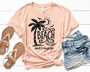
Take a look at this shirt.
What is the message it wants to give?
Simply that the person is craving to go to the beach or they are at the beach because they couldn’t resist the urge.
What is the voice/essence of the message?
The text makes the reader think of the soothing, relaxing, fun or adventurous feeling that comes from being at the beach (this may be different for different people).
How do the font and its placement complement the message?
The combination of wavy (pun intended), casual typefaces, paired with different sizes for different parts of the text, as well as the swirls and twirls, give a relaxing feel. You can almost hear the ocean and find yourself taking a walk down memory lane.
And that is just the effect that the designer wanted.
Now, moving on:
Pair Fonts with Each Other Well
There are many things to consider here.
When you’re using multiple fonts in a single design, you need them to be in complete harmony with each other.
And there are two sides to this:
- Don’t use two (or more) fonts that are very similar to each other. The subtle difference will make your shirt look off because it will seem like a printing fault or some other unfortunate mishap. It just won’t work. At least most of the time anyway.
- Don’t use two (or more) fonts that clash with each other. Notice we didn’t say “two fonts that are very different from each other.” Fonts that are different usually provide great contrast and work really well together. But if they clash – and you will know when they do – it will be a design disaster waiting to happen.
Pair the Fonts with Other Design Elements
As important as the font is for the t-shirt, it does not work alone.
It is part of a larger design plan that includes many other things such as the
-
Color/s of the text
A t-shirt font design that fits the text perfectly on its own may not work with the color scheme you have in mind. One that looks great in a certain shade may look hideous in others.
The color of the text again should also reflect the tone of the message and the emotion you want to invoke in the wearer of the shirt, as well as the people who see him or her wearing it.
-
Color of the shirt
Contrast is key when you want different elements in the same space to stand out.
This means that you need the base color of the shirt to work well with all aspects of the text it contains – especially the font and the color.
-
Placement of the text
Where the text lies on the shirt is important when deciding the best font for a t-shirt design.
The shirt can be designed in a variety of different ways. It may contain only text, only imagery with a little bit of text, and both imagery and text in somewhat equal proportions.
The font should be chosen with the location of the text in mind.
-
Size of different parts of the text
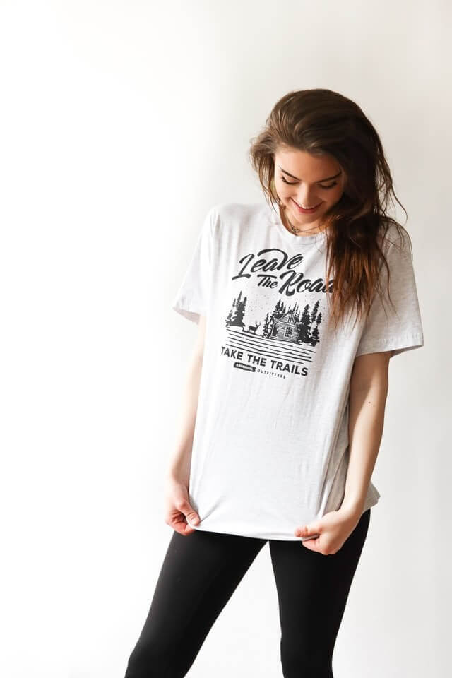
Take a look at this shirt.
There are multiple ‘layers’ of text if you must, and each of the layers is a different size.
The line that was likely intended to attract the most attention is the largest. The other text is smaller – and notice that it uses a less catchy font too.
T-shirt font styles are closely related to the size of various parts of the text on the shirt, as well as what the creator wants you to focus on the most.
-
And so on
This means that the best shirt fonts are those that have been shortlisted after they have been tested with all the design elements that make the shirt.
Choose the Best T-Shirt Font Design from the Shortlisted Options
At this stage, you will have a couple of fonts in various designs, sizes, colors, etc. We suggest coming back to these later.
Concentrating on the minor details of something can sometimes make it hard for you to see it as a whole again. At least straight away.
Give yourself a break and come back to your final options with a fresh mind. Once you do, the better design will usually pop out and be quite easy to spot.
If it doesn’t, you can give yourself more time or ask a colleague for some advice.
Trust Your Aesthetic Sense and Judgment
While it is okay, and even recommended at times, to ask other people for advice and suggestions, you need to trust your own judgment.
This goes for whether you are designing your own website, creating an Ad post for Facebook, or in your case, designing t-shirts.
Aesthetic sense and knowing what works, where, and when, are skills that you can enhance along the way but you need to trust in your ability to reach the perfect end result.
In fact, the more you learn to rely on yourself and trust your judgment, the better you’ll become at making the right calls – and quicker too.
Before we move on, here are some top tips that can help up your t-shirt design game even further.
Don’t Stick to the Same Design Elements
While it is important for your brand to have a distinctive voice, using the same design elements, including your favorite t-shirt fonts, over and over again eventually becomes boring.
And your customers will notice.
You will end up having nothing new to offer to them and they will eventually stop picking you.
So it is important to mix it up every once in a while and never stop experimenting – that is the only way you will broaden your design horizons and stay in the game.
Don’t overdo it
It is often tempting to make a design as “extravagant” as possible – to have multiple elements and layers. Complex, if you must.
The truth is, designs like these mostly end up becoming overly complicated and displeasing to the eye.
And so this is our advice to you: don’t use too many fonts, too many words, or too many colors in the same design.
There are a few designs in which that can work, sure. But most of the time, less is more.
Having said that, in a more complex design, don’t stick to just one font either – it will end up having no dimension and being very boring.
Pay Attention to Space and Placement
Quite often, designers tend to make designs and, hence, fonts larger than they need to be. Why? Simply because they feel they need to fill more space.
When it comes to t-shirts, there are no hard-and-fast rules.
You can have a print that takes up most of the shirt, such as in the beach shirt we shared with you.
Or you can convey the message with barely any text or other design elements at all! Like so:
Here is a great guide we came across that will help you understand the anatomy of t-shirt design and create works of art:
T-Shirt Graphic Size and Placement
Choose Readability Over Style
If you’re putting text on your shirt, it is because you want people to read it.
But as in the case with overdoing the number of fonts and other elements on your shirt, you can also over-complicate the design using decorative fonts excessively.
Maybe use a word or two in a decorative font and the rest in a plain font. Or another approach you feel is better.
But make the text easy to read while being classy at the same time.
Don’t Scale and Distort
Proportion matters more than you would think.
Don’t choose a square font and then scale it to make it taller – choose a taller font from the get-go.
You may think stretching it out a little bit won’t do much harm but there is a reason font is made as it is.
And there is a reason why there are so many fonts to choose from in each category – so that you don’t have to do things like these (lol).
Identifying Good T-Shirt Fonts from Bad Ones
This is where your judgment and aesthetic sense are really put to the test. With practice, you will instantly be able to spot a good or bad font.
How?
Well, a good font will instantly make you feel good. Paired with the actual message and the other design elements, it will trigger a positive emotional response, transport you to another place, and just make you happy.
Bad typography, on the other hand, will instantly feel off. You will know that something is wrong, even if you are unable to put your finger on it. It will make you feel uneasy – even elicit a negative emotional response.
You may not have noticed this but this happens to you all the time.
At the store. When you see a friend in an unattractive t-shirt. When a fashion icon has the audacity to wear a disaster.
And while your opinion about another’s style choices is just that, an opinion, you benefit from this ability to instantly differentiate good from the bad when it comes to your own work.
And this, understandably, helps you make your designs better.
What Printing Specifics Do I Need to Know?
So you have designed a shirt that looks perfect on-screen.
It sports a combination of the best fonts, designs, colors, and love (you know you poured your heart and soul into it if it turned out this great).
Now imagine how you would feel if the design got ruined during printing.
Or don’t. Because if you take care of these two things, you will be good to go:
- The most common and widely-accepted file formats for t-shirt printing are PNG and JPEG. This is mainly because of its high resolution.
- The suggested resolution is 200dpi and 4000×4000 pixels – basically the file size should be less than 10 MB so that it can be easily loaded but not very small as that will affect the quality.
Find more details about this here.
We have discussed in detail how you can choose the best fonts for t-shirts.
But what do you choose from?
We haven’t forgotten our promise of sharing with you the resources where you can get thousands of great fonts.
Interested?
Here they are!
Top Resources for Fonts
As a designer, you can never have too many fonts. There will come a point when you just won’t be able to find a font on your computer or software that clicks. And that is when this list will come in handy!
Here is a list of some of the best places you can find t-shirt fonts for free.
- Dafont
- Google Fonts
- Font Squirrel
- 1001 Free Fonts
- The League of Moveable Type
- Behance Free Fonts
- Font Library
- What the Font
Some resources have both options for you – free and paid. Examples include:
Others you have to pay for to use, such as:
Important note:
There are rules and regulations governing the use of fonts. Find out more by giving this blog post a read: The Law on Fonts and Typefaces in Design and Marketing: Frequently Asked Questions (about commercial and non-commercial use)
Summing Up

By this point, you must be ready to start experimenting with t-shirt font styles with a fresh outlook.
Remember, it is always about getting the message across in the perfect way possible.
So, whether you like the falling letters font or the bachelorette font is your favorite, you need to base your decision not on personal preferences but on the message, the voice, and the other design elements among other things.
Do that and we guarantee that your words will have the desired impact and you will build a loyal base of customers who will keep coming back for more.
Got something to add? Share it in the comments section below!
Related posts:
 Understanding Sustainable Competitive Advantage and the Role of Digital Media in Achieving It
 How Does Discord Make Money? What Is Discord’s Business Model?
 House of Quality [Quality Matrix] & Quality Function Deployment [QFD]: A simple guide
 In-House Vs Agency – Choosing Your Content Marketing Route
Leave a Comment